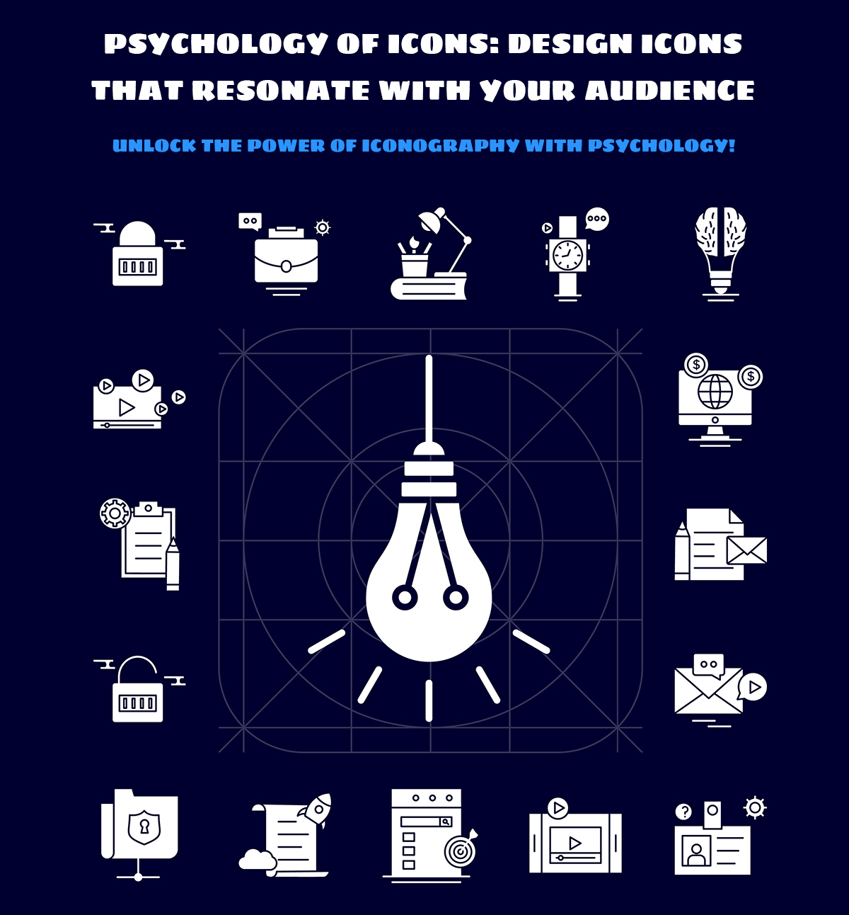
Icons are an important aspect of many user interfaces since they communicate objects, activities, and concepts. They are powerful visual tools that express messages and emotions. They are a crucial component of the visual language we utilize to communicate our values, brand identity, and message to our audience.
However, creating icons that are meaningful to your target audience is a difficult process. To create designs that trigger the appropriate emotions and meanings, you must first grasp the psychology of icons.

Here are some essential tips for designing icons that resonate with your audience:
1. Understand the context:
Understanding the context is important for icon design since it guarantees that icons are relevant, effective, and culturally significant. Icons are simple visual representations of complex ideas or activities. They are utilized in a variety of places, such as websites, applications, signage, and marketing materials. Also, they frequently have many meanings and interpretations.
For example, if a designer creates an SVG icon for a website targeted at a global audience, they must consider how other cultures understand the icon’s meaning. Certain cultures may view a thumbs-up gesture as a favorable indication. But other cultures may view it negatively or even as disrespectful.
Designers can create icons that express the intended message by considering the context in which they will be utilized. This may lead to improved user experiences, more engagement, and more effective concept communication.
2. Use familiar metaphors:
Employing familiar metaphors helps to make icons more intuitive and simple to use. People can instantly recognize the function of an icon and interact with it without having to think too hard about it. This enhances the user experience and helps the product or service’s trust and confidence.
Familiar metaphors are a form of visual shorthand that draws on our shared cultural knowledge of everyday objects and concepts. For example, a magnifying glass icon is well-known for representing search or zoom features, but a gear icon is frequently used to represent settings or options.
Overall, using recognizable metaphors is an essential part of icon design since it improves the effectiveness and usability of icons. Designers may build icons that are both relevant and intuitive for their audience by employing commonly recognized icons and themes.
3. Use color and shape psychology:
Color psychology is the study of how colors influence human behavior and emotions. Each color has its own meaning and may elicit different emotions. For example, blue is connected with trust and dependability, but red is connected with passion and fire. While creating icons, it is critical to examine the emotions and meanings connected with various colors and use them to express the appropriate message.
Shapes have different meanings and may elicit various emotions. For example, circles are connected with unity and completion, but squares are connected with stability and balance. While creating icons, it is critical to examine the shapes that will be utilized and how they will be used to convey the intended meaning.
Knowing the meanings and emotions connected with various colors and shapes is essential for creating successful icons that convey the appropriate message. You may build icons that elicit the desired emotions and reactions in your audience by applying color and shape psychology.
4. Keep it simple:
We keep icons simple since their aim is to convey information fast. They deliver visual clues to the user without disturbing or overpowering them. Humans are more likely to recall a simple icon than a complicated one. This is due to the brain’s ability to interpret basic shapes and forms more rapidly and efficiently.
While creating icons, keep the icon’s function and context in mind. The icon should be created to complement the style and look of the application or platform. To minimize misunderstanding, it should also be made to stand out from other icons.
5. Test and iterate:
Icon design requires testing and iteration to ensure that the final result meets the needs of the target audience.
Testing helps designers to gather feedback from the target audience or customers to enhance the design. They can conduct usability testing to verify that the icons are easy to recognize and comprehend. They may also test the design on various devices, screen sizes, and resolutions to verify that it functions effectively across several platforms.
Iteration means making changes or modifications depending on feedback gained throughout the testing phase. Designers may improve the design to ensure that it communicates the desired message or meaning. They can also make changes depending on customer input to improve the user experience.
Wrap-up:
Icon psychology is an important component of creating successful and meaningful icons that engage with your audience. Users’ perceptions and interactions with icons can be influenced by the usage of icons, colors, shapes, and other design components. Designers may build icons that successfully express their intended message, improve user experience, and achieve their design goals by understanding the psychological concepts behind icon design.
Designers may develop their icons through testing and iteration to ensure that they match the demands of their audience and deliver a smooth user experience. Ultimately, creating icons that are meaningful to your audience is a collaborative effort that demands empathy, creativity, and a thorough grasp of user requirements and preferences.
Optimizing life and web-pages. Either you will find me immersed in the world of images and vectors or watching cricket.