You’ve invested a lot of time and effort into the presentation and you want it to stand out from the crowd. The question is how do you get the conversation going? Well, there are several tools you can use to make your PowerPoint presentation look spotlight worthy that don’t involve adding arrows and cool fonts.
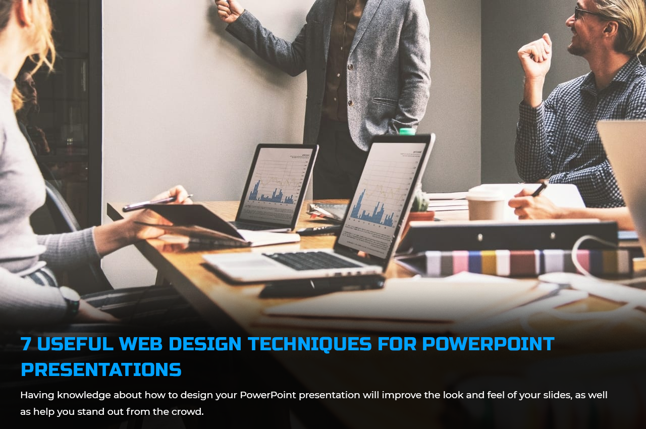
Having knowledge about how to design your PowerPoint presentation will improve the look and feel of your slides, as well as help you stand out from the crowd.

Here are 7 web design techniques for PowerPoint presentations that could help add polish to your web designs:
1. Use a professional graphic design tool:
You can use PowerPoint to create beautiful slides, but the program’s limited options mean it’s not the best software for professional presentation graphics. If you want to create something truly dazzling, consider hiring a professional graphic designer with experience in PowerPoint. A good designer will be able to make your custom slides look great on any device and in any environment.
2. Add images and videos:
Images and video content are extremely valuable, whether it is used on a website or in a PowerPoint presentation. Adding images and videos to websites helps boost search engine rankings and generate more sales. PowerPoint supports both images and videos. You need to put each file into separate layers and then group them by category or type.
You can also incorporate visuals into your PowerPoint presentation to make it more effective. Minimum textual content should be kept in a good presentation. This entails using visually appealing content to better describe ideas and support the message you want your audience to understand.
However, this does not imply inserting random images and videos into the slides. It would be beneficial if you chose which visual aid will best help you describe a specific idea. When including visuals in your PowerPoint presentation, aim to be strategic and relevant.
3. Make use of Elegant Fonts:
Good font selection brings out the best in your presentation and gives your slides personality. The fonts you choose determine how easy it is for the viewer to digest the information on your slide. What they see visually on your slide will stick with them longer than what they hear from your speech.
Use simple fonts that are easy to read from a distance, with up to two font styles in your slides. Also, use the first font only for highlighting topics or headlines and the second font for the body if you choose to use two fonts.
4. Limit the use of bullet points.
People aren’t interested in reading the text-heavy bullets on your slide. Remember that you want to capture and keep your audience’s attention. Reduce the number of bullet points and text on a slide and replace them with more visual content.
One way to highlight your content is to use icons. They make slides look more meaningful, communicative, and help break down language barriers because they are more intuitive. Professional and quality SVG icons can be obtained from a variety of popular websites like iamvector.
Icons are widely used, and we see them every day in road signs, restroom signs, shopping malls, and so on. The universal use of Free SVG icons allows you to communicate more effectively while lowering the risk of your audience reaching the wrong conclusion.
5. Use color gradients throughout your slides
You’ve probably noticed that all of the best websites use color gradients in their designs, from background colors to text colors, and even the logo! This is because color gradients add depth and dimensionality to any design, making it appear more appealing and polished.
Color will improve the effectiveness of your presentation. The good news is that you can create your own color palette or use one that PowerPoint already has. You can also change the color palettes on PowerPoint to match the theme of your presentation.
6. Make it Responsive for a Big Screen
The benefits of making your website mobile responsive cannot be overstated. Making sure that your website looks good on both small and large screens improves its chances of success. Otherwise, you run the risk of losing website visitors to competitors with more responsive websites.
Other platforms, such as PowerPoint presentations, also require responsiveness. Presentations are typically projected on large screens so audiences can view the contents. You must ensure that your presentation appears the same on a large screen.
Text may appear perfect on a computer screen but become blurry on a larger screen. To avoid this, ensure that your presentation is tested on both small and large screens.
7. Fluid Navigation:
Nobody wants to battle with navigation when they are online. A company can lose a lot of clients if its website is difficult to use. Web designers use simple and organized navigation to help visitors rapidly find essential information.
Elegant navigation is important for more than just web pages. To avoid disruptions during the presentation, make it simple to browse your PowerPoint presentation slides. Your audience may not understand your presentation if you can’t browse it smoothly, just like on a website.
Last Words:
It is difficult to create an effective PowerPoint presentation. As previously stated, one of the most difficult responsibilities for presenters is preparation for the presentation. But if you’ve read the recommendations in this article or have a basic understanding of web design, it shouldn’t be too difficult.
These are some of the most effective web design approaches for PowerPoint presentation design. It is preferable to have simple navigation, make your presentation responsive on various screens, and employ visuals to effectively express concepts. Remember these pointers to get the most out of your presentation.
Optimizing life and web-pages. Either you will find me immersed in the world of images and vectors or watching cricket.