The look and feel of your icons are important to your website. If you have adopted a stock icon for your website, you probably noticed that the icons are not exactly the same as those icons displayed on your competitors’ websites. If you have not customized the background of your icons too, it may be difficult to distinguish one icon from another. Customizing the border and background of your icons can make them easier to identify and differentiate from one another.
When you need to make a change in your icon design, this is the time to get creative! You can customize the border and background of your icons by simply dragging and dropping them onto your desired background. This makes it easy to change the color of the icons without having to redraw them.
When you’re working with icons, a lot of times you want to get rid of the white space on the right side of your icons. You can add borders and backgrounds to your icons using CSS, however, it may take up too much space on the page and limit the size of your icon. If you’re using a custom icon pack, this process is even easier because you don’t have to worry about resizing the image or changing the color of pixels.
This article will demonstrate how you can change both the borders as well as backgrounds of your icons.

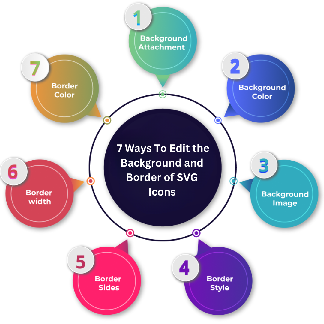
A. Background:
This is the feature that is used to manage and create the background of the design project.
Background attachment:
The background image is adjustable or fixed w.r.t. to the entire page. The background picture remains fixed, it does not change while scrolling. However, if the image is scrollable, you will view it while scrolling through the entire page.
Background Color:
The property can be used to determine the element’s background color. The color is determined by the name of the color, which determines the HEX and RGB values. You can also specify the transparency within the same property to control the color of the elements. It can range from opaque to transparent. You can alter it ranging from 0.0 and up to 1.00. The less the value, the more the transparency.
Background-Image:
The property places an image to be placed in the background area of an element. Background images are fixed so that the image is completely covered by the element.
Background position:
The location where the image’s background appears can be determined by this property. The top-left position on the site is the most common position for it, however, you are able to change the position to other places, such as:
- Top
- The bottom
- left
- Right
- Center
Background Shorthand:
Like borders, the values of the individuals in backgrounds are contained in the same property. This is an efficient method.
That was some information about the background. Now let’s learn about the border. After getting the required information, you can customize the icons accordingly.
B. Border:
Borders play an important function in designing, whether an application, icon, or website. It is the term used to define various aspects like width the style, color, and style of the border of the design. It assists in making the design simple for users.
Border types:
Different designs may necessitate different border types. CSS offers various styles for this purpose, such as
- On all four sides, The border is visible across all four sides.
- It is located only on the bottom The border is only visible at the bottom.
- On the left: The traditional UI design approach is to create a border on the left side.
- Rounded Borders: The borders can be regular or round and the degree of rounding is determined by the sides.
Border Style:
This is helpful for showing the border design within the icon. Here are a few styles that can be used:
- The border is concealed.
- Dotted Border: Its border is drawn with dots.
- Dashed: The border is dashed.
- Solid: This is the border. Solid.
- Double Border: It is a border that doubles.
- Groove The border has a 3D groove.
- Ridge: It is a 3D Ridge.
- Inset Border: The border is a 3D inset, giving the element the appearance of being embedded.
- Outset. The border has a 3D outset which gives the appearance of embossed embossing.
- Note that the border is not present.
If no border is stipulated, the border will be not part of the design.
Border Sides:
The border’s variable values are established, defining the borders to each corner: top Bottom left-right. Different values show various designs on the designated side. Look at the possibilities of combinations to be explored on it:
1. If there are Four values Then, you can create it:
- Top=solid
- Bottom= double
- Left = dotted
- Right= dashed
2. If there are three values it is possible to create it:
- Top=solid
- Bottom= double
- Left and right = dotted
3. If there are two values it is possible to create it:
- Top and bottom = solid
- Left and right = dotted
4. If you have a value that is present, there is a way to design the value as follows:
- All the sides are solid

The border Width:
In CSS it defines the size of all four sides, and borders are defined using values such as
- keyword = Px, pt, cm, em
- Length = thin Medium, thick
A variety of values per side could be set according to the design. In case just one value is defined and the rest of the sides will be of equal width. When more than two values are specified, it will affect the final outcome in the layout.
Border Color:
Property determines the color of the four edges of the border and, if not selected, the border is picked up its color. The color is determined by defining the color’s name and setting the value that is HEX, RGB, or HSL.
Like border styles and border style, it includes values that range between one and four, representing borders’ left and right bottom and top.
Border Shorthand:
Each of the values for individual properties such as color width, style, and so on. They are all set within one property. Separate the properties by giving them space. It is possible to write the declarations in either shorthand or long form.
It could make the code shorter and more concise, but the chance of errors increases.
Rounded Border:
The borders’ edges may be straight or smooth. Different values define the edges from slightly round to the most round. The border-radius property defines the border’s elements. The property is set to assign one value for the four values.
Border Padding:
The content of the element from the border is differentiated by padding. In the absence of padding, there is a gap between the border and the content. In order to add padding, the values can be either length or percentage that range between negative and positive. The negative values do not render, however, those that are positive render. You can set it to up to four values similar to other properties.
All these help in creating free vector icons through which you can make the website user-friendly and different from existing ones.
Wrap up:
Customizing the border and background of your icons can make them easier to identify and differentiate from one another. Using a custom icon pack, you don’t have to worry about resizing the image or changing the color of pixels. This article will demonstrate how you can change both the borders as well as backgrounds for your icons. Different values show various designs on the designated side.
If no border is stipulated, the border will be not part of the design. The traditional UI design approach is to create a border on the left side. Separate the properties by giving them space. It could make the code shorter and more concise, but the chance of errors increases with each type of declaration. The values for individual properties such as color width, style, and so on.
Optimizing life and web-pages. Either you will find me immersed in the world of images and vectors or watching cricket.