Creating icon sets for web design is a complex task, and a lot of work is put into it. Designing icon sets differs from creating the standard icons used in mobile apps, websites, and other digital media.
For one thing, you don’t need any knowledge of vector-based design when building iconic app elements using this method. You also want to maintain a specific level of icon consistency across your designs because icon sets rely on each other as part of a more significant brand identity.
The process is simple, but the tools used to create icon sets vary, and you must think about how the design will appear once it is presented to users. The designing of an icon set is similar to the process of creating websites. As such, icon design requires a checklist to ensure that your designs are on-brand and consistent in appearance. If you are also new to this, here are some Simple graphic design checklists and best practices for designing icon sets.
However, first, let’s see what icon sets are.

What are Icon Sets?
Many web designers prefer to set up their websites with a custom icon set, but they aren’t sure what an icon set is. Simply put, an icon set is a collection of free vector icons representing different objects or ideas.
These can include emotions, professions, and economic systems to important website information like search keywords and social media profiles. The icon set is a great way to create a cohesive brand identity for websites, mobile apps, and other platforms where web designers work.
Graphic Design Checklist to Create Icon Sets
Here are the top 10 tips to help you create a great icon set.
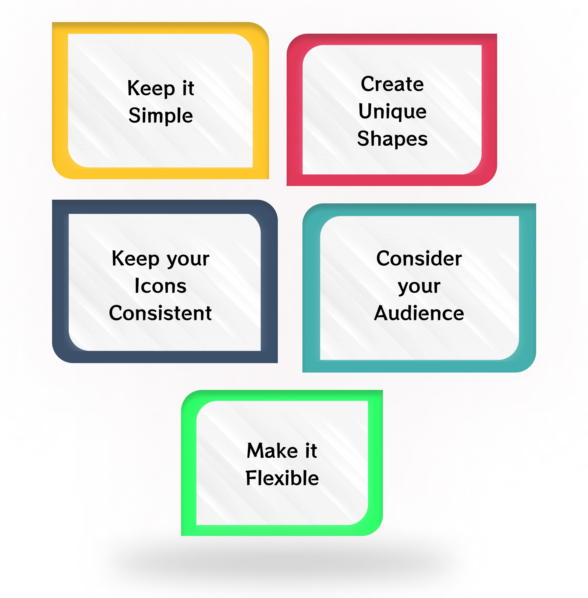
Keep it Simple
It’s easier to go overboard with creating a great icon set than it is to create one that doesn’t have enough visual appeal. A simple icon set will have a limited number of icons for people to click on, making your website less confusing for visitors.
Each icon in your set needs to have a similar visual weight, but you can make them visually distinct. You can also use free vector icons for creating icon sets.
Create Unique Shapes
Your icons must be unique yet look good with others in the collection. Some shapes, usually a trial and error case, will work better than others.
For example, rounded rectangles can be used for contact cards, not branding icons. Square icons look great when used as an app, game start buttons, or navigation elements in horizontal desktop design.
Keep your Icons Consistent
You can have fun designing icon sets that are completely different from each other, but it’s essential to keep at least some elements of your set consistent.
Mixing and matching objects like emoticons, robots, or animals into your icon set could confuse people or send mixed signals. As a general rule of thumb, the number of elements in your icon set should be no more than 10% of the total number of characters.
Consider your Audience
Every icon set needs to be targeted at a specific audience. If you create an icon set for nautical pictures, your target audience will likely be people who enjoy sailing, boating, and other water sports.
If you’re creating an icon set for a preschool or private school, your icons should have a more child-appropriate design. In contrast, icons for adults interested in stock companies and retirement plans may have a different visual style.
Remember your Colors
You’ve likely heard the saying, “black and white make gray.” This saying is especially true for the colors of objects in your icon set.
For example, you might like the uniqueness of using orange roses in one icon and blue roses in another. But this might translate poorly for people after a few years since orange roses are no longer available, and blue roses are still popular.

Make it Flexible
One of the biggest problems with icon sets is that they don’t scale well. Make sure you scale your icons down to 12px in size without losing their visual quality. Nowadays, almost all digital devices can scale your design, so you don’t have to worry about maintaining quality in a smaller size.
Keep the Point of Your Icon in Mind
The best sets use simple shapes and colors to create a cohesive brand identity that is unique and memorable. To achieve this, you must understand what sets your icons apart from others and how they will be used.
Avoid using too many colors, gradients, images, and minimalism because it can easily overwhelm people looking at them for the first time.
Add the Human Touch
The most effective icon sets have elements that make them pop and accurately represent the specific brand, product, or service they represent. If you’re designing icons for an app or website, this also includes knowing how to portray interactivity with the icon.
For example, a set of cartoon animals can be designed to capture the look and feel of an online pet store. But, you could also transform the same animals into more realistic-looking pets suitable for an animal hospital.
Vectorize the Best Sketches
No matter what software you use to create your icons, it is always a good idea to vectorize all your sketches in case you want to make an icon set. An excellent way to make icons is to sketch them in Adobe Illustrator.
While you can use raster images, vector images offer better control over your output and make it easier to maintain your work.
Use a Tool to Help You Design
If you’re creating your icon set, you’ll need access to some icon editor software. There are plenty of free icon editors to help you create your free vector icons, but the learning curve is steep.
These tools allow you to easily create an icon set for various social media platforms. They will allow you to export that same logo in multiple different formats. All free vector icons can also be used to design icon sets, along with SVG icon downloads.
Wrapping Up
Icon sets are used for many reasons that go beyond just looking good. Designing a new icon set can be fun, but patience and attention to detail are also required. If you want to create an icon set that users will respond well to, you should take the time to consider how your icons are going to relate to each other. Also, think about who you’re designing for and how your icons will appear on different platforms.
There’s nothing like adding new icons to your design to make it stand out. Whether you want to use free vector icons to draw attention to a particular part of your website is up to you. Integrating a new icon set into your design can be a great way to improve the usability of your design, making navigation more intuitive.
Until next time, happy designing!
Gulshan Kumar is a WordPress and full-stack developer, as well as a fitness freak. He loves coding and enjoys sharing his knowledge with the community. This lad started his journey back in 2018 and since then, he’s been customizing IamVector and writing about what he knows best.