When it comes to designing icons, there are a few things to keep in mind. One is that icon design should be simple and straightforward, making it easy for users to recognize and understand. Additionally, the well-crafted icons have style and precision. For example, an icy background suits better than a gradient Background for an ice cream cone.
Another thing to keep in mind when designing icons is the use of typeface. While some may prefer the modern fonts used in iOS apps or games, others may prefer older fonts or even a classical font if they are looking for an iconic look. Always experiment with different typefaces and see what works best for your brand or product! Let’s have a look at a few tips and tricks you can use to improve the icon design styles.
What are icons and what are they used for?
When you first heard of icons in design, you might have wondered what are icons and what are they used for? Let me answer that here. let’s get started and know all about icons.
The icon is an image representing an application or specifies a type of entity and even any concept. It is a hypertext link to a page that represents the topic of that page. Lexical is the programming language for the same.
In other words, an icon is a type of graphical representation or sign that depicts an item, activity, concept, or idea. Icons often easily get recognized. They also offer a visual representation of something specific.
Icons are often used in the context of computer interfaces and graphical user interfaces (GUIs). It symbolizes various apps, files, functions, or features. They function as visual shortcuts, allowing users to easily recognize and access certain activities or material. For example, a trash bin icon is frequently used to depict the activity of removing files, but a printer icon denotes the print function.
Designing icons:
Designing icons can be very creative. But are the designs so effective that they can be used? The icons must be not only different but must also have all the standards that can make them user-friendly.

These factors can be used while designing icons:
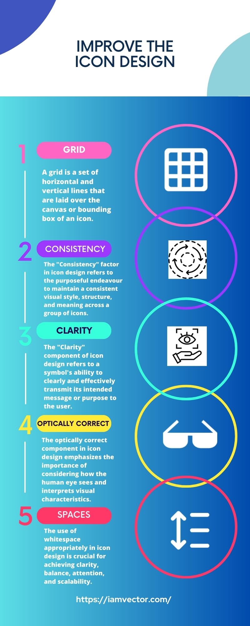
1. Grid :
A grid is a set of horizontal and vertical lines that are layered over the canvas or bounding box of an icon. It functions as a structural framework for arranging and aligning the icon’s numerous parts. Grids help the developer specify the content. It has some dimensions which on the following can help the designer to create and enhance their icon.
There is a total of 24*24 Grid. The icon is placed within 20*20 dimensions. There is a padding of 2*2. This is the overall layout. The specific grid system and its arrangement may vary based on the user’s preferences and the project’s needs.
2. Consistency:
In icon design, the “Consistency” element refers to the conscious attempt to preserve a uniform visual style, structure, and meaning across a group of icons. Consistency is important because it guarantees that the icons in a set or system operate well together. It also ensures that icons are easily recognized and understood by users.
Consistency improves user experience by making icons easy to comprehend and interact with. It promotes familiarity, decreases cognitive burden, and establishes a consistent visual identity. When icons within a set or system have consistent visual qualities and transmit consistent meanings, users may readily recognize and comprehend them.
For example, icons with different strokes have a very inconsistent appearance. To avoid this, the lines must be equal and consistent from all aspects. This will have a better visual than the inconsistence one.
3. Clarity:
Just imagine an icon with multiple elements. Are these types of icons easy to use? The answer is no. Multiple elements in a single icon make it overcrowded and not even visually good appearing. In fact, the icon must have only those elements which are associated to that with minimum elements and simple design.
So, the “Clarity” component in icon design refers to a symbol’s capacity to clearly and efficiently express its intended message or purpose to the user. Clarity is critical since icons frequently act as visual signals or symbols. Their function should be obvious at a glance.
Designers may ensure that icons are obvious, easy to understand, and successfully communicate their intended purpose to users. Icons can do this by concentrating on simplicity, unique silhouette, consistent visual language, metaphoric representation, scalability, and user feedback. Clear svg icons increase user experience, minimize cognitive burden, and improve program and interface usability.

4. Optically correct:
In icon design, the “Optically Correct” component refers to the purposeful manipulation of visual elements to produce the appearance of balance, accuracy, and pleasant aesthetics. It entails making little changes to forms, lines, spacing, and proportions to accommodate how human eyes perceive and interpret visual data. Even if they are not mathematically exact, the objective is to produce icons that seem visually balanced and harmonious.
The optically accurate component in icon design underlines the significance of taking into account how the human eye sees and interprets visual features. Designers may build icons that are aesthetically pleasant, balanced, and look harmonic to consumers by making careful alterations based on visual perception. These optically accurate modifications improve icon beauty and usefulness.
While designing, sometimes some designs appear different by using different shapes, like square, circle, rectangular, etc. despite keeping the dimensions same for every shape. This happens due to the fact that the shapes have different optical visions. To avoid this condition, the icon’s optical vision has to be checked and then designed along with the dimensions.
5. Spaces:
The “Spaces” element in icon design refers to the intentional use of negative space, also known as white space, within and around an icon. Negative space refers to spaces that are purposely left vacant or unlabeled around or inside the design of an icon. The judicious use of whitespace is critical in generating aesthetically balanced, readable, and striking symbols.
The appropriate use of whitespace in icon design is critical for attaining clarity, balance, attention, and scalability. It adds to the overall visual aesthetics and usefulness of icons, ensuring that they express their intended message simply and quickly.
The container of the grid must be filled completely. If there are some empty spaces in the container it will not look good but if you have filled the container properly it will look more appealing.
6. Combine styles:
“Combine Styles” refers to the purposeful mixing or merging of several design styles within a series of icons or even inside a single icon. It is the creative process of mixing numerous visual components, approaches, or styles to produce a distinct and unified style that meets the ultimate design goal.
It is critical to find a balance when combining styles in icon design to ensure that the final icons remain aesthetically consistent and intelligible. To produce a harmonic fusion of styles that efficiently communicates the desired message while keeping aesthetic appeal, the symbols’ purpose, context, and target audience should be carefully considered.
For example, while using a Free SVG icon, different actions can be implemented like a different style, color, shape or fill, or shadow.
Conclusion:
Use your own creativity to improve the icon design styles for your site. By using different designs and techniques, you can create icons that are more unique and eye-catching. There are a variety of ways to improve the icon design styles on your website, so use these tips to get the look you want.
Gulshan Kumar is a WordPress and full-stack developer, as well as a fitness freak. He loves coding and enjoys sharing his knowledge with the community. This lad started his journey back in 2018 and since then, he’s been customizing IamVector and writing about what he knows best.